Analyzing Flight Data with Python
In this project, I imagined that I worked for a travel agency and needed to know the ins and outs of airline prices for my clients. I want to ensure the best deal for my clients and help them understand how airline prices change based on different factors.
I decided to look into my favorite airline: Delta Airlines.
The data include:
miles: miles traveled through the flightpassengers: number of passengers on the flightdelay: take-off delay in minutesinflight_mealIs there a meal included in the flight?inflight_entertainmentAre there free entertainment systems for each seat?inflight_wifiIs there complimentary Wi-Fiwifi on the flight?day_of_week: day of the week of the flightweekendDid this flight take place on a weekendcoach_price: the average price paid for a coach ticketfirstclass_price: the average price paid for first-class seatshoursHow many hours did the flight takeredeyeWas this flight a redeye (overnight)?
Before starting any analysis, we need to read the dataset. First, let’s import pandas and then read the CVS file. We can name the dataset “flight”.
import pandas as pd

flight = pd.read_csv("https://raw.githubusercontent.com/itankar1/Python_Project/main/flight.csv")
print(flight)
We can see that the dataset is composed of 12 columns and 129,780 rows.
Univariate Analysis
The first step I took while conducting my analysis was to analyze the data univariate.
My first question was: What do coach ticket prices look like? What are the high and low values? What would be considered average? Does $500 seem like a good price for a coach ticket?
print(flight.coach_price.min())
print(flight.coach_price.max())
print(flight.coach_price.median())
print(flight.coach_price.mean())

flight.coach_price.describe()

Let’s visualize the price of the price of coach tickets.
flight.coach_price.hist()Now, visualize the coach ticket prices for flights that are 8 hours long. What are the high, low, and average prices for 8-hour-long flights? Does a $500 ticket seem more reasonable than before?
import matplotlib.pyplot as plt

# Filter the flights that are 8 hours long
eight_hour_flights = flight[flight["hours"] == 8]

# Plot the coach ticket prices for the filtered flights
plt.hist(eight_hour_flights["coach_price"])
plt.xlabel("Coach Ticket Price")
plt.ylabel("Frequency")
plt.title("Distribution of Coach Ticket Prices for 8-hour Flights")
plt.show()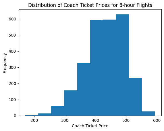
eight_hour_flights["coach_price"].describe()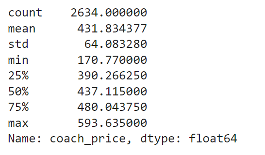
How are flight delay times distributed? Let’s say there is a short amount of time between two connecting flights and a flight delay would put the client at risk of missing their connecting flight. You want to understand better how often there are considerable delays so you can correctly set up connecting flights. What kinds of delays are typical?
flight.delay.describe()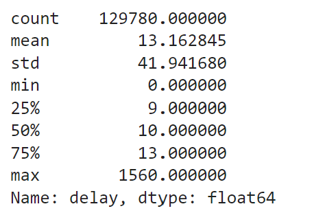
flight_13_delay = flight[flight['delay'] >= 13]
print(flight_13_delay)
sns.histplot(flight.delay[flight.delay <=500])
plt.show()
plt.clf()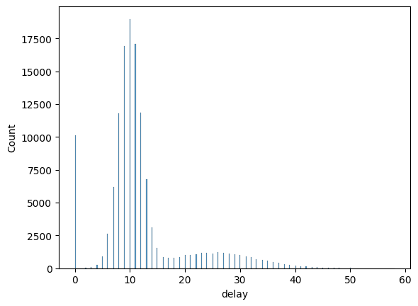
Bivariate Analysis
Create a visualization that shows the relationship between coach and first-class prices. What is the relationship between these two prices? Do flights with higher coach prices always have higher first-class prices as well?
sns.scatterplot(x=flight.coach_price, y=flight.firstclass_price)
plt.show()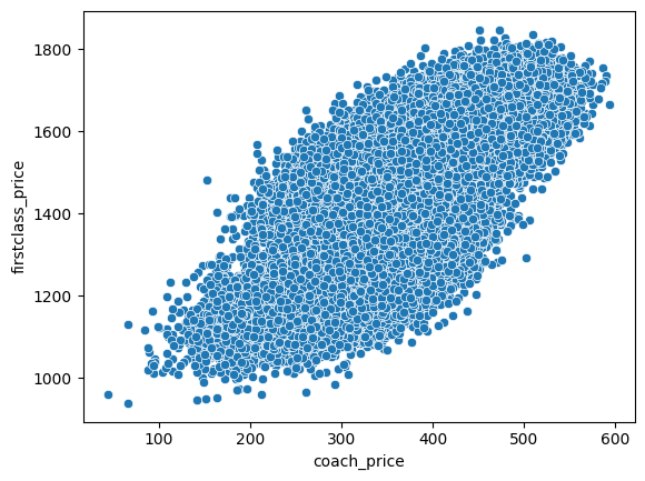
What is the relationship between coach prices and inflight features — inflight meals, inflight entertainment, and inflight wifi? Which features are associated with the highest increase in price?
sns.histplot(flight, x = "coach_price", hue = flight.inflight_entertainment)
plt.show()
plt.clf()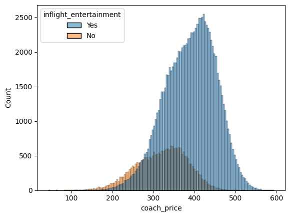
coach_entertainment_yes = flight.coach_price[flight.inflight_entertainment == 'Yes']
coach_entertainment_no = flight.coach_price[flight.inflight_entertainment == 'No']

coach_entertainment_yes_mean = coach_entertainment_yes.mean()
coach_entertainment_no_mean = coach_entertainment_no.mean()

diff_entertainment = coach_entertainment_yes_mean - coach_entertainment_no_mean
print(diff_entertainment)
sns.histplot(flight, x = "coach_price", hue = flight.inflight_wifi)
plt.show()
plt.clf()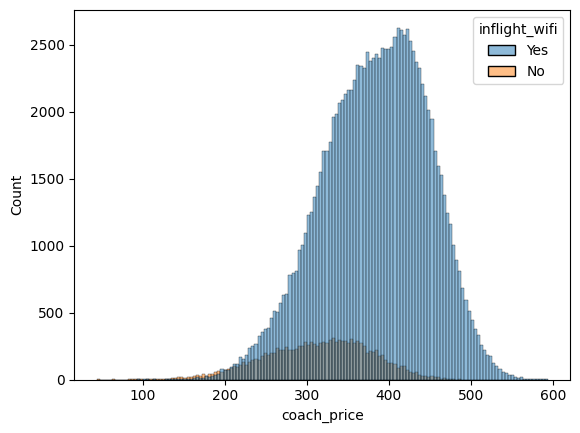
coach_wifi_yes = flight.coach_price[flight.inflight_wifi == 'Yes']
coach_wifi_no = flight.coach_price[flight.inflight_wifi == 'No']

coach_wifi_yes_mean = coach_wifi_yes.mean()
coach_wifi_no_mean = coach_wifi_no.mean()

diff_wifi = coach_wifi_yes_mean - coach_wifi_no_mean
print(diff_wifi)
sns.histplot(flight, x = "coach_price", hue = flight.inflight_meal)
plt.show()
plt.clf()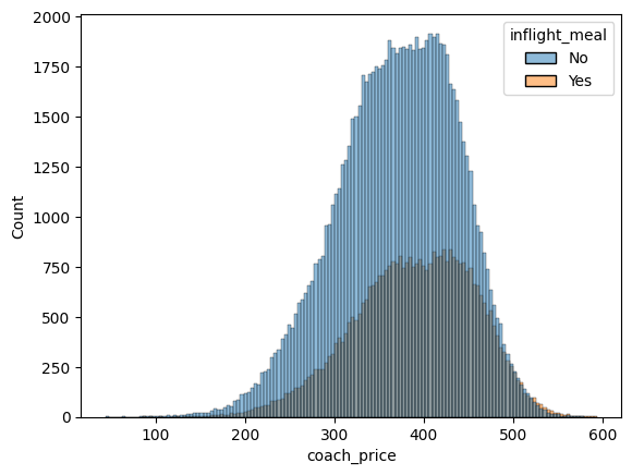
coach_meal_yes = flight.coach_price[flight.inflight_meal == 'Yes']
coach_meal_no = flight.coach_price[flight.inflight_meal == 'No']

coach_meal_yes_mean = coach_meal_yes.mean()
coach_meal_no_mean = coach_meal_no.mean()

diff_meal = coach_meal_yes_mean - coach_meal_no_mean
print(diff_meal)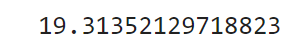
How does the number of passengers change in relation to the length of flights?
perc = 0.1
flight_sub = flight.sample(n = int(flight.shape[0]*perc))

sns.lmplot(x = "hours", y = "passengers", data = flight_sub, x_jitter = 0.25, scatter_kws={"s": 5, "alpha":0.2}, fit_reg = False)
plt.show()
plt.clf()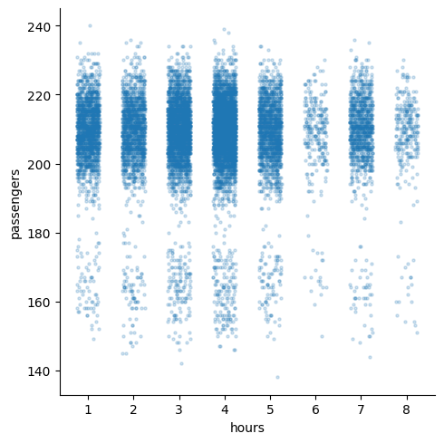
Multivariate Analysis
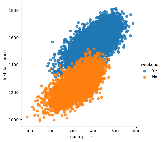
Visualize the relationship between coach and first-class prices on weekends compared to weekdays.
sns.boxplot(x = "day_of_week", y = "coach_price", hue = "redeye", data = flight)
plt.show()
plt.clf()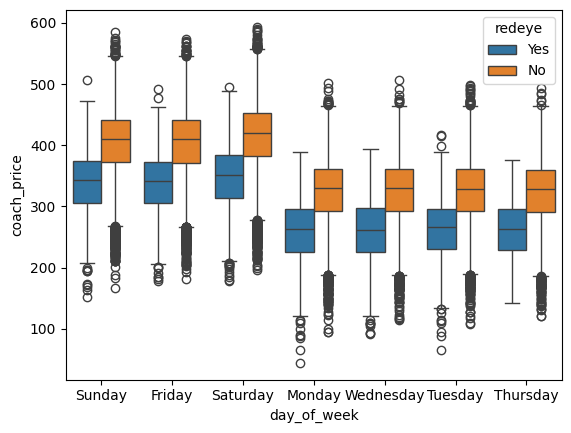
How do coach prices differ for redeyes and non-redeyes on each day of the week?
sns.lmplot(x ='coach_price', y='firstclass_price', hue = 'weekend', data = flight_sub, fit_reg= False)
plt.show()
plt.clf()